고정 헤더 영역
상세 컨텐츠
본문
 <div class="iframe__container">
        <iframe class="video__box" src="https://www.youtube.com/embed/DXT9dF-WK-I" title="YouTube video player" frameborder="0" allow="accelerometer; autoplay; clipboard-write; encrypted-media; gyroscope; picture-in-picture; web-share" allowfullscreen>
        </iframe>
 </div>
위와 같이 코드를 작성한 상태.
반응형으로 하기위해 검색을 해서 내가 처음 완성했을때의 CSS
(1)
.video__box {
  min-width: 100%;
  min-height: 100%;
  @include mq($BREAKPOINT-XS) {
    height: rem(200);
  }
  @include mq($BREAKPOINT-MD) {
    height: rem(715);
  }
}
(1)과 같이 작성하는 경우 보이는 영상의 형태
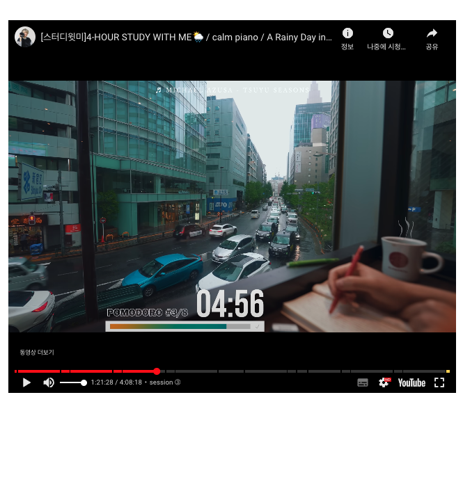
화면 크기에 따라 영상 옆으로 검은색 띠가 표시 된다.
이를 위해 코드를 다시 수정했는데 여기서 내가 전혀 생각지 못한것은
padding-bottom 에서 %값으로 비율을 맞추는 부분
.iframe__container {
  position: relative;
  width: 100%;
  height: 0;
  padding-bottom: 56.25%; /* Set the aspect ratio of the video (16:9) */
}

.video__box {
  position: absolute;
  top: 0;
  left: 0;
  width: 100%;
  height: 100%;
}

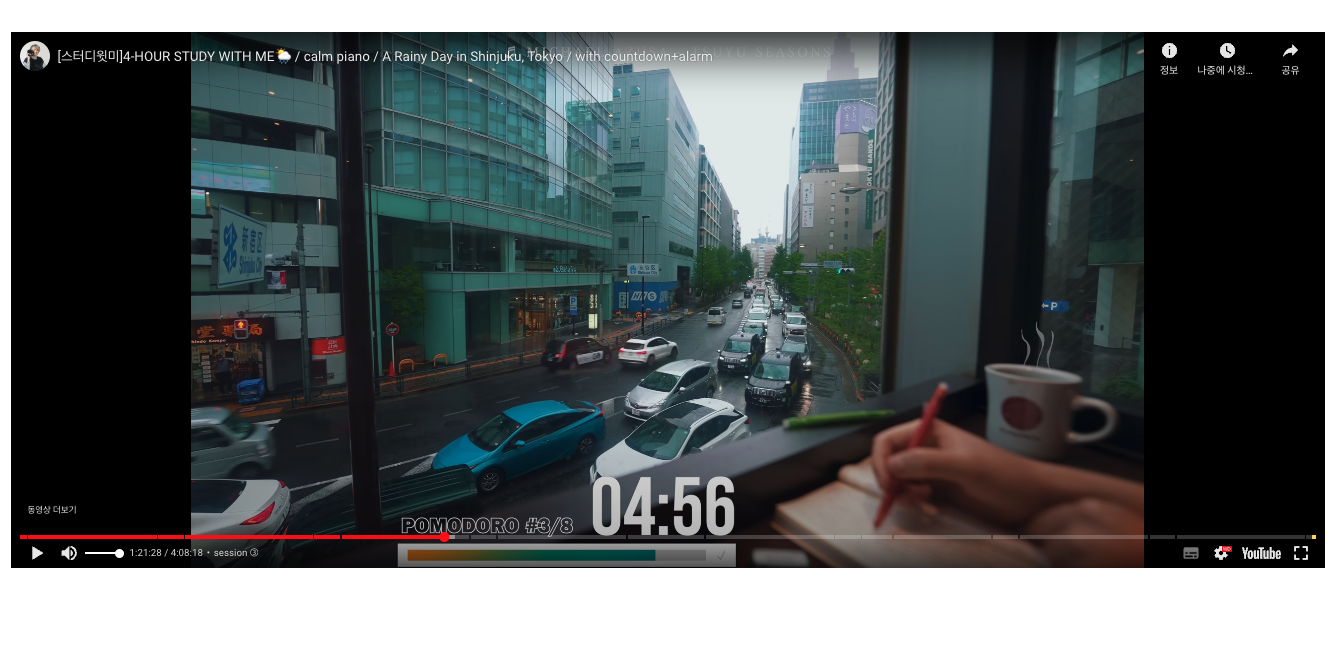
화면이 커져도 검은띠가 생기지 않고 영상이 표시된다
'프론트엔드 > HTML,CSS' 카테고리의 다른 글
| 반응형에서 텍스트 줄바꿈 (0) | 2023.06.30 |
|---|---|
| 같은 클래스와 태그 반복문 적용하기(pug) (0) | 2023.06.06 |
| @import, use, forward 차이점 (Sass) (0) | 2023.05.26 |
| em, rem 차이 (0) | 2023.05.22 |
| 맥북에 pnpm 설치하기 (sudo 사용해서 에러 해결) (0) | 2023.05.17 |


